版画草子 All That Print Work

自作版画作品と日常の写真を日記形式で紹介してゆきます。
(画像の無断使用は固くお断りします。)

Quiet Town

2007-09-10 11:06:35 | 作品 Works

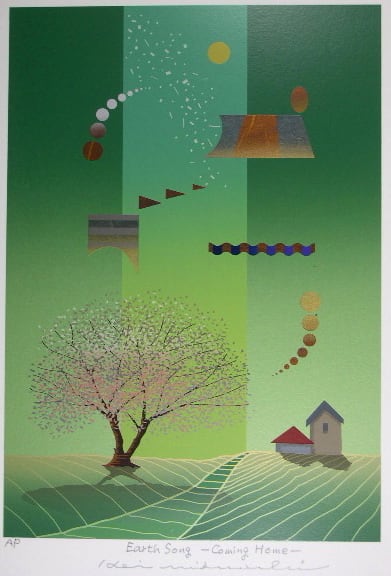
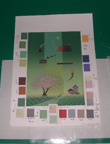
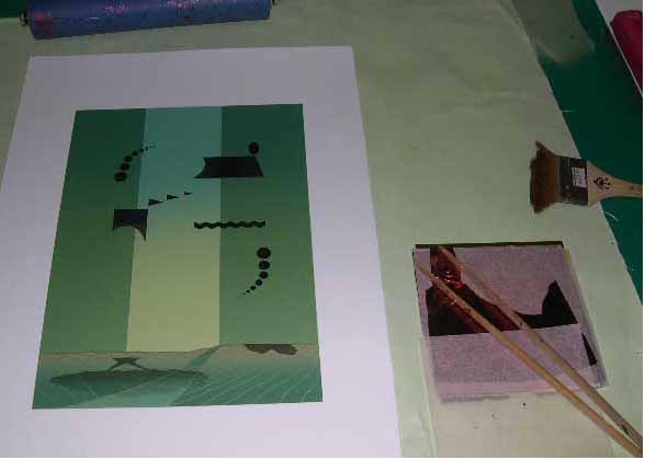
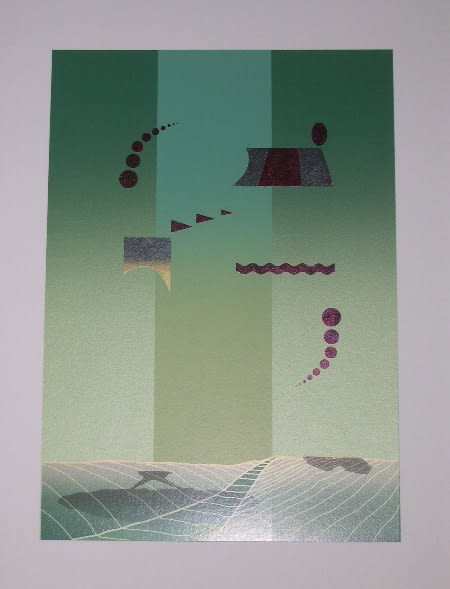
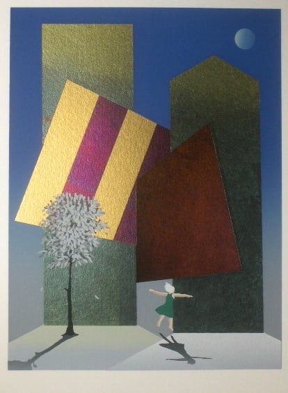
Quiet Town 100×80mm ED 30 2003年制作

あの衝撃の「9.11」から6年
あまりのショッキングな映像で想像力が
ついてゆけず 現実味の欠いた不安定な気分は
今も続いているようです。
この作品は「その」2年後に描いたものですが
不安感・無力感が依然私の内部に強く残っていたようです。
「9.11」を契機に 人間に対する・世界に対する
戸惑いを描いた3点のうちの1点です。

Six years have passed since that extremely shocking “9/11”
When I watched such a devastating scene,
my imagination became unable to work.
Since then, it seems that my unrealistic and insecure feelings
have been lasting.

I produced this two years after that.
The uneasy and helpless feelings are left deep in my mind still now.
This is one of three works I tried to represent
perplexities of the human beings and the world in the wake of “9/11”


<今日の一句>

蟻運ぶ 夏の終わりの アブラゼミ

(我が世の夏と盛んに鳴いていた蝉も 
今は蟻のご飯として穴に運ばれてゆきます)


にほんブログ村 美術ブログへ

にほんブログ村 美術ブログ 版画へ

にほんブログ村 英語ブログ 英語の日記へ

Candy Ball Party (1)

2007-09-04 16:27:02 | 作品 Works

Candy Ball Party (1) 530×800mm ED 30 1997年制作

この2点は「気持ち良く創った」感じが素直に出ていて
我ながらこれを作った時の心理状態や健康状態が
いいバランスであったように思います。
残念なのはタイトルです。
作品タイトルはかなり重要なものと思っているのですが
この時はどうしてこの題にしたのか憶えていません。
まったく変な題にしたものです。

I was apparently in a good mood when I produced these two works.
My mental and physical states were probably well-balanced.
But my regret is the title.
Although titling is important, I have no idea why I gave them such a title.
Don’t you think it is an odd one?


<今日の一句>

蝉時雨 雌は静かに 産みつづけ

(鳴いているのは雄ばかりと気ずいて出来た句です)

次回はNORIKO先生の登場です。お楽しみに


にほんブログ村 美術ブログへ

にほんブログ村 美術ブログ 版画へ

にほんブログ村 英語ブログ 英語の日記へ

Candy Ball Party (2)

2007-09-02 17:55:27 | 作品 Works

Candy Ball Party (2) 530×800mm ED 30 1997年制作

この作品は10年前に2点連作で制作したもので
私の気に入っている作品のひとつです。
タイトルは特に意味はありませんが「青春」を
テーマに創った作品です。

「軽やかで 明るく 想いを秘めて 熱く」

そんな気持ちを込めてみたものです。
手元に作品がないのでデジタル画像を
載せられないのが残念です。
(つい新作を優先するので 追加刷りが
なかなかできません)
出来れば実物を見ていただきたいところです。
ちなみに 札幌では 
浜田クリニック(南3西2マリオンビル4F)の
待ち合い室に飾っていただいています。
(浜田先生ご無沙汰しています。相変わらず
γ-GTPは良くないです.......)
東京では養清堂ギャラリーにあります。

次回はCandy Ball Party (1)を紹介します。

This is one of the series of two works I produced 10 years ago
and one of my favorites.
There is no deep meaning for the title, but the theme is “adolescence”
“Lighthearted, cheerful, but passionate deep in their heart…”
I tried to put such feelings into it.
It’s a pity I can’t post the digital image, since I haven’t it on hand now.
I always put producing new works ahead of reprinting old ones.
I would like you to see the real print if possible.
You can see one at Hamada Clinic (south 3 west 2 ) in Sapporo
(Dr. Hamada, How have you been? My γ-GTP value is high as usual)
In Tokyo, one of them is mounted in Yoseido Gallery, Ginza.

Next time, Showing Candy Ball (1)


にほんブログ村 美術ブログへ

にほんブログ村 美術ブログ 版画へ

にほんブログ村 英語ブログ 英語の日記へ

色の道教えます(7)A Story of Colors (7)

2007-08-29 17:45:19 | 作品 Works
私は若い頃 スクリーン印刷会社に2年程
勤めたことがあります。
その時担当したのが「調色」で 
以来「色師」というあだ名が付きました。
(今ではこのあだ名で呼ぶ人は一人だけですが.....
 ーひろみちゃん ご無沙汰してますー)

そんな経験と以後の制作などを通じて
どんな色を見ても ほぼどの基本色で構成されているか
解るようになりました。
唯一の あまり一般には役立たない特技です。

As I was young, I worked for a screen-printing company around two years.
At that time, I was in charge of making ink, namely, color- matching.
Then, I was nicknamed “Iro-Shi”
….Iro means “color” Shi means “ teacher” however, when these two words
are combined, it has another meanings “Amorist”…..
(Nowadays, there is only one person who calls me “Iroshi”…Hi! Hiromi
How have you been? )

Through such experiences and producing activities,
even though I see any color ,
I've leaned to know which basic colors are used to make it.

This is my only specialty, but generally, of no use….


祭りの余韻 400×300mm ED 50 2006年制作Afterglow of a festival
「色は線よりも人の心を解放する」
マティスの言葉です。
皆さんも久し振りに水彩で「解放感」を
味わってみてはいかがでしょうか。
(最近は¥100SHOPでもいい水彩があります)

”Colors free one’s mind more than lines do” Matisse said.
Why don’t you enjoy a sense of freedom with watercolors?
Good watercolors are available at a 100yen shop, these days.

「色の道教えます」は今回で一応終了します。
次回は相方が担当します。

This is the end of the color story.
The next time is my partner's version.


夏の青がゆ(ワカメと塩鱒入り)Summer Gruel.Wakame and salted trout in it.

今年の猛暑中も 朝は熱々のおかゆをいただいていました。
During the scorching summer, I've had hot gruel.


にほんブログ村 美術ブログへ

にほんブログ村 美術ブログ 版画へ

にほんブログ村 英語ブログ 英語の日記へ

色の道教えます(6)A Story of Colors

2007-08-27 18:42:30 | 作品 Works
実際の調色例<2>An instance of color matching (2)


基本としてまず 黒・赤・黄・白から混ぜてゆきます。
この選色はやはり長い経験でしょうか。
予想配色割合 黄40%・黒20%・赤20%・白20%

First of all, I mix black, red, yellow, and white ink.
It’s basic way I learned by experience.
The following is the percentage of each color I thought in advance.
Yellow 40%, black 20%, red 20%, white 20%


調色用の版で試し刷りをしながら
色を近づけてゆきます。

Printing repeatedly, through the screen for color-matching,
I bring the ink closer to the designated color.


いまいち深みというか 青みが足りないようです。
このような場合 すぐ青を入れるのではなく
12色相順に
グリーンを混ぜてゆきます。
(画像では微妙な色の違いが良く出ていません)

The color looks in short of depth and a tincture of blue a little.
In this case, I add green first, not blue immediately.
In the order of th12 basic hue circle, I tried to start with green
toward blue. (Sorry, I can't show the subtle shade on the blog)


7回目の試刷りで最も近い色が出来ました。
結果配色割合 黄35%・黒25%・赤15%・白20%・緑5%

This is the closest color, after the seventh try.
This percentage is as follows,
Yellow 35%, black 25%, red 15%, white 20%, green 5%

つづく to be continued


にほんブログ村 美術ブログへ

にほんブログ村 美術ブログ 版画へ

にほんブログ村 英語ブログ 英語の日記へ


色の道教えます(5)A Story of Colors(5)

2007-08-25 17:39:13 | 作品 Works
実際の調色例<1>An instance of color matching (1)

何か例えが解りやすくて 調色の難しい色の
サンプルを考えて思いついたのが
「LOUIS VUITTON 」のBagのベースに使われている
こげ茶色です。

I’ve looked for a color somewhat recognizable for every one
and difficult to make it.
And the color that occurred to me is dark brown
used as a base color of“Louis Vuitton” bags.


しかし我が家はブランドというものに ほとんど
興味・関心がないので 「本物」も
-ソウルの路上でお兄さんが叫んでいたような-
「完璧なニセモノ」もありません。
そこでフランスの伝統色から近い色を想像して
選んでみました。
DIC F-75番ブラン・フォンセ(Brun Fonce)

However, we are not interested in expensive brand name goods at all,
so haven’t any “genuine one” nor “perfect fake”
……We were once hailed by a young guy who was selling
L.Vuitton-looking bags on the street in Seoul.
“These are perfect fakes!” he said in Japanese……
Therefore,I picked a close color by imagination
from the French traditional color samples
This is DIC F-75 (Brun Fonce)


この色を以前紹介した
スクリーン用インク10色から作り出してみます。 つづく

I’ll try to make it out of the 10 basic ink I introduced before.
To be continued.


Photo by NORIKO


にほんブログ村 美術ブログへ

にほんブログ村 美術ブログ 版画へ

にほんブログ村 英語ブログ 英語の日記へ

色の道教えます(4)A Story of Colors(4)

2007-08-21 13:10:00 | 作品 Works
日・中・仏3ヶ国の伝統色「名」はそれぞれ特色があって
日本は動・植物・自然の風物関係
中国は服飾関係が特に多く 例えば
高貴な人が使った服の色とか 京劇の主役の色とか
フランスは食べ物が他に比べ圧倒的に多く見られます。
(逆に意外と中国はほとんどありません)


Regarding names of the traditional colors, each country has its own characteristics.

Most of the Japanese names are related to Flora and Fauna,
and things Japanese.

As for Chinese one, many colors are related to clothing.
For example, a color of the aristocracy’s costume,
or Beijing Opera star's one.

In France, they are overwhelmingly related to”food and drink”
(Unexpectedly, I could hardly find names of food in Chinese colors.)


French traditional colors
上から ウイスキー色・ブルゴーニュの赤ワイン色・
ボルドーの赤ワイン色・シャンペン色・コニャック色・
ビスケット・カラメル・マロングラッセ・クリーム・
焦げたパンの色・砂糖で焼いたアーモンド色・
砂糖で固めたアーモンド菓子・ハッカ入りのボンボン・
コーヒー色・カフェオーレ・ショコラ・カレー色

解りやすい色もありますが 「何だ?」という色もあって
お国柄が出ています。

(備考)
日本の伝統色ー「日本色彩研究所」による調査・資料
中国の伝統色ー中国中央美術学院の教授が収集・選定した320色
フランスの伝統色ー「仏和色名辞典」に基ずく321色

先日のお昼 つけ麺大盛り

この季節冷たい麺が最高です。
1日1回は麺が食べたい私です。(2回でもいいです)


にほんブログ村 美術ブログへ

にほんブログ村 美術ブログ 版画へ

にほんブログ村 英語ブログ 英語の日記へ

色の道教えます(3)A Story of Colors(3)

2007-08-19 12:07:41 | 作品 Works
お暑うございます。
今日から再び「色のお話」をしてゆきますが
暑さ の中適当に読み流して下さい。
Scorching days are continuing and I'm continuing the color story.

作品の配色を決めたり 調色をする時は
色見本帳を利用します。
私は多くの場合「大日本インキ化学」が出している
「DIC色見本帳」を使っています。

When I think a color scheme in my work or mix ink for making a designated color,
I refer to some color samples, mainly “DIC color sample” published by a leading
ink company in Japan.


上記の他に「伝統色シリーズ」というのもあります。

Other than this, there are country-by-country traditional
color samples.
From left, Japan, France, China


この中の「日本の伝統色」には「誕生色」というのがあります。

In Japanese color traditional sample, I found what is called
“ Birth Color”..

(1981年十日町織物工業協同組合作成)
どういう基準で決めたのか解りませんが
「誕生石」みたいなものですね。

It seems like “Birth Stone” ,but I don’t know what it is based on.


<1月ー深緋(こきひ)2月ー若草色 3月ー桜色 
4月ー幹色 5月ープラム 6月ー緑青 7月ー薄藤
8月ー薄蘇枋(うすすおう)9月ー紺色 10月ー桔梗色
11月ー朱色 12月ーベビーブルー> 
5月と12月ちょっと違和感があります。
I don't make sense about May and December....

北海道も暑かったようですが NORIKO先生から
涼しげな写真が届きました。

A refreshing photo from Noriko

安平(あびら)町の鹿公園 苫小牧方面


にほんブログ村 美術ブログへ

にほんブログ村 美術ブログ 版画へ

にほんブログ村 英語ブログ 英語の日記へ

色の道教えます(2)A Story of Colors(2)

2007-08-05 09:34:49 | 作品 Works
前回はやはり「色の道」を誤解した方が
多かったようでアクセス数が増えました。
すいません。

My "colorful life"remark apparently caused misunderstanding
about a story of colors.
On my last blog, I had many visitors. Sorry for that.


子供の頃 水彩絵の具をいろいろ混ぜて遊んだ人も
多いと思います。
私は最終的に全部混ぜるとどんな色になるか
ワクワクしてやってみました。
でも汚いこげ茶になってがっかりしたのを覚えています。
これが私の「色の道」への始まりだったようです。

As a child, haven't you had an experience of mixing
various watercolors ?
Excited by expectation, I tried to concoct all of
the watercolors I had.
The result was really disappointing to me.
" What dirty brown it is ! "
My colorful life started that way.


実際のインクを使って(ここではスクリーン版画用のインク)
色を混ぜて目的の色にする ー調色ー は 基本色10色 
赤・黄・レモン・緑・藍・群青・紫・紅・白・黒 だけで
何万色 何十万 いや無限に作り出します。

Arranging several kinds of ink for silk screen,
I make a designated color, which we call "color-matching"
Out of 10 basic ink.....red, yellow, lemon, green, indigo,
ultramarine, purple, carmine, white and black......
I make millions of colors, as rather limitless ones.


夏の色 トマト a color of summer
近所の元農家から朝早くいただきました。(我々まだ寝てたんです)
In the early morning, a neighbor brought them to us
We were still sleeping.

にほんブログ村 美術ブログへ

にほんブログ村 美術ブログ 版画へ

にほんブログ村 英語ブログ 英語の日記へ

倒立する人 A Man Doing a Handstand

2007-07-30 17:06:02 | 作品 Works

倒立する人 A Man Doing a Handstand 
200×300mm ED 70 2004年制作

多くの人が子供の頃 一人遊びをしたと思いますが
私も意味の無い 妙な一人遊びをしていました。
5~6歳のころ 三越デパートの包装紙の赤い
模様をひたすら切り抜いて箱にためたり........
晴れた日には毎日 近くの空き地の材木に
登ってカッコウの鳴き声を上げていたり........
何を想っていたのか 今ではもう解りません。

Many of the people might have played alone as a child.
I also played on my own with something strange
and meaningless.
When I was five or six years old,
I was absorbed in clipping red parts out of
wrapping paper of Mitsukoshi Department store
and kept them in a box.
In a good weather, I used to mimic singing Cuckoos
on lumber in a vacant lot.
I don't know what had in his(my !) mind.


にほんブログ村 美術ブログへ

にほんブログ村 美術ブログ 版画へ

にほんブログ村 英語ブログ 英語の日記へ


丘を越えて Over the Hill

2007-07-24 16:11:07 | 作品 Works

丘を越えて -Happy Rider- 120φmm
ED 70 2007制作

最近は梅雨時に加え蒸し暑いので
すっかり散歩から遠ざかっています。
運動不足なのに麺とビールの量は変わらないので
この作品のように自転車をこがなければ
だめかもしれません。

Due to the muggy rainy season,
I have hardly taken a walk these days.
Despite shortage of exercise,
beer and noodles consumption has never decreased.
I had better ride a bike like this girl.

相方はこの文を書くまで「girl」だと思っていたそうです!
私は「boy」を描いていたつもりなのですが.....
皆様はいかがでしょう?
My partner thought the rider was a girl,
until she translated it. I drew a boy...
How about you?
「丘を越えて」はアメリカで「Happy Rider」という
副題が付けられ妙に人気があるそうです。
(完成時 私としては決していい出来とは
 思わなかったのですが.........)
私の想いと読みがひどくずれた作品になったようです。

Subtitled " Happy Rider ", this Hanga appears
to be popular in America for some reason.
When finished it, I didn't feel it very good though.
This work seemed to bring the different result
from my expectation.

(札南残念でした.... 北も南も駒・駒なんて.......)


にほんブログ村 美術ブログへ

にほんブログ村 美術ブログ 版画へ

にほんブログ村 英語ブログ 英語の日記へ

スクリーン版画の出来るまで(11)The process of Silkscreen(11)

2007-07-22 10:36:43 | 作品 Works
完成 Completion

Earth Song -Coming Home- 300×210mm
ED 70

画面保護と退色防止のために全面に
クリアーインクを刷って完成です。

Printing clear ink over all in order to
protect the surface and to prevent discoloring,
this print has completed.


刷り増しの時のために使用した色等を記録しておきます。
今回は22色+下地・クリアー・赤貝箔・青貝箔 を
使いました。

For reprinting, I place record on used colors
and so on.
This time,I used base ink and clear ink,
red-shell and blue-shell leaves in addition to 22 colors.


この日のお昼は 「欧米か!ゆ」でした。


にほんブログ村 美術ブログへ

にほんブログ村 美術ブログ 版画へ

にほんブログ村 英語ブログ 英語の日記へ

スクリーン版画の出来るまで(10)The process of Silkscreen(10)

2007-07-20 10:18:10 | 作品 Works

道具・材料あれこれ
スキージ Squeegees


スクリーン版画ではインクを刷り込むスキージが
重要な道具です。
板前さんで言えば包丁でしょうか。
私は4.5cmから85cmまで 用意してあります。

In silkscreen printing, a squeegee,
which forces ink through the screen
is one of the most important tools,
probably like knives for chefs.
I keep many of them, ranging in length
from 4.5cm to 85cm.

他にテープ類も他の版種よりいろいろな
テープを使用します。

In addition, I prepare various type of
tapes for masking.


紙テープ・セロテープ・ガムテープ・両面テープ等々
版上で部分的にマスクしたり 版を固定するのに
使います。

さて ひと仕事終えたらお腹も空きます。

今日は沖縄土産のソーキそばでした。


にほんブログ村 美術ブログへ

にほんブログ村 美術ブログ 版画へ

にほんブログ村 英語ブログ 英語の日記へ

スクリーン版画の出来るまで(9)The process of Silkscreen(9)

2007-07-18 10:05:29 | 作品 Works
大きな台風が通り過ぎた途端 またも 地震.......
改めて日本の環境の厳しさをおもい知らされました。
前回のブログを更新中に目眩のような
長い揺れを感じ 不安に思っていましたが.....
被害に遭われた方々には 心からお見舞い申します。

箔貼り Leafing

インクと同じように 乾きの遅い接着剤を刷って
そこに箔をのせてゆきます。写っている箔は
日本伝統の「赤貝箔」というものです。
銀箔を加工して玉虫風の色合いにしてあります。

Print slow-drying glue,instead of ink,
through the screen.
Lay leaves on the glued part.
The leaf is Japanese traditional one,
named red-shell leaf, which is processed
silver leaf and has iridescent shades.


貼り終えた状態

箔の特徴が良く出せた作品です

September Moon( 既出September Moon)
ストライプの赤いところが 赤貝箔です。
左右の建物風は 青貝箔を使っています。
Red-shell leaf is used in red striped parts.
And blue-shell leaf is used in building -like parts .

にほんブログ村 美術ブログへ

にほんブログ村 美術ブログ 版画へ

にほんブログ村 英語ブログ 英語の日記へ

スクリーン版画の出来るまで(8)The process of Silkscreen(8)

2007-07-16 10:17:31 | 作品 Works
実際の刷り(今回の作品は当初の原画と異なります)
Now, start printing.
(the work posted today is different from
the design shown on June 24)

版の枠を刷り台に固定して
1 刷る紙の位置を決め
2 スキージでインクを版上に広げます。

1. Fix the frame on the printing table.
Place paper beneath the frame
and decide the position of the paper.
2. Spread ink on the screen with a squeegee.


3 スキージを下に押し付けるように引くと
4 下の紙にインクが刷り込まれます。
(手の出演は娘です)

3, Pull the squeegee, then it forces ink
through the screen.
4, The ink forms images or letters on the paper below.
( My daughter demonstrated )

何かご質問がありましたら どうぞお寄せ下さい。
Any question and comment will be welcomed.
にほんブログ村 美術ブログへ

にほんブログ村 美術ブログ 版画へ

にほんブログ村 英語ブログ 英語の日記へ